Hawk
Fire suppression systems

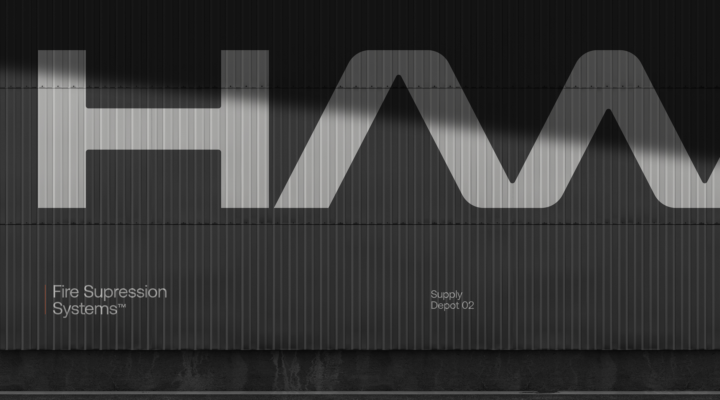
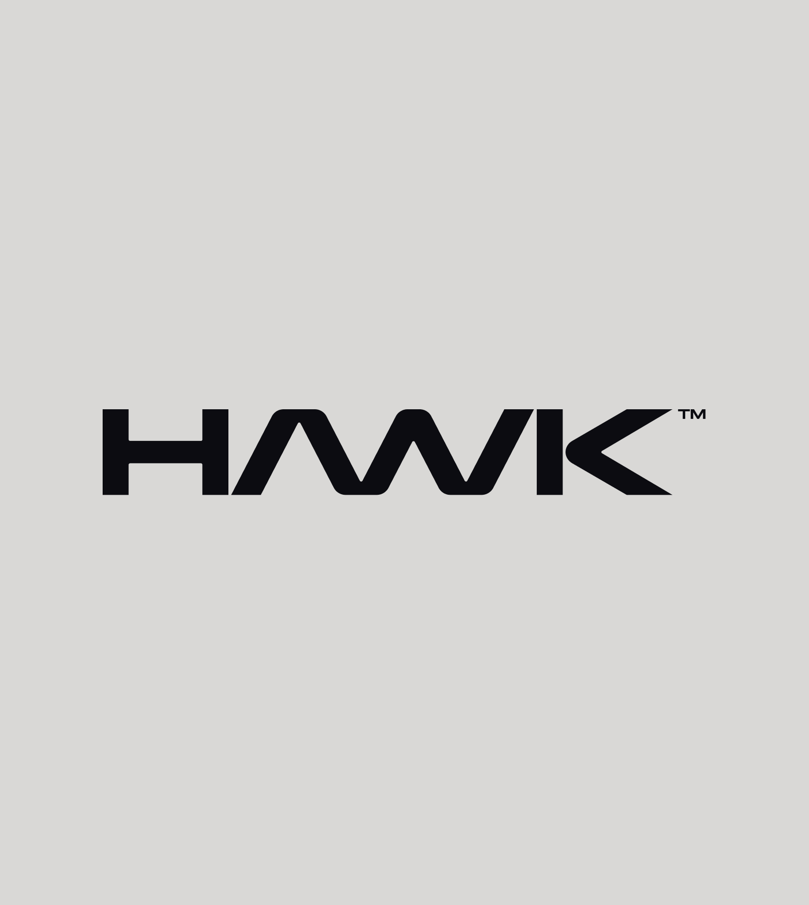
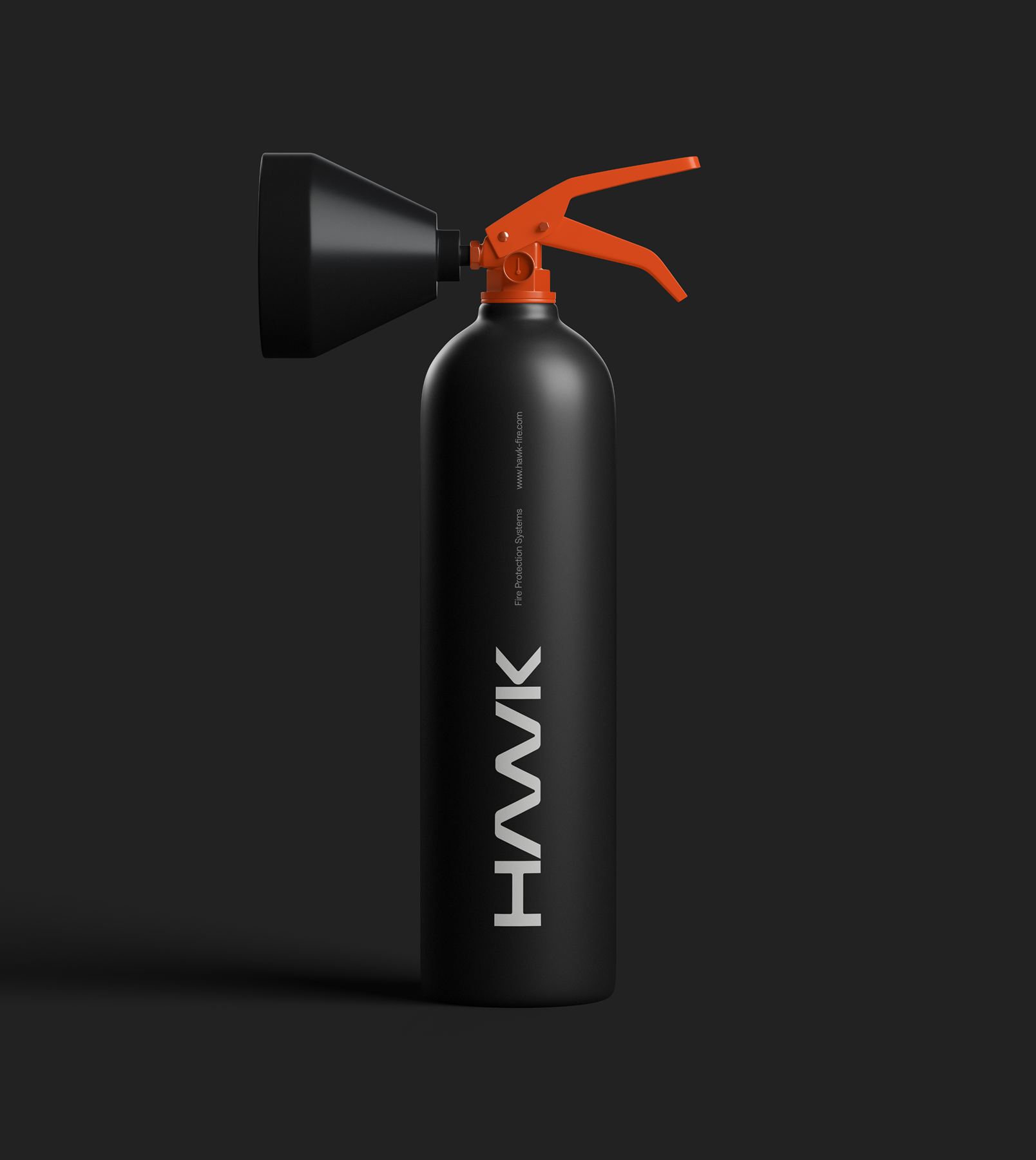
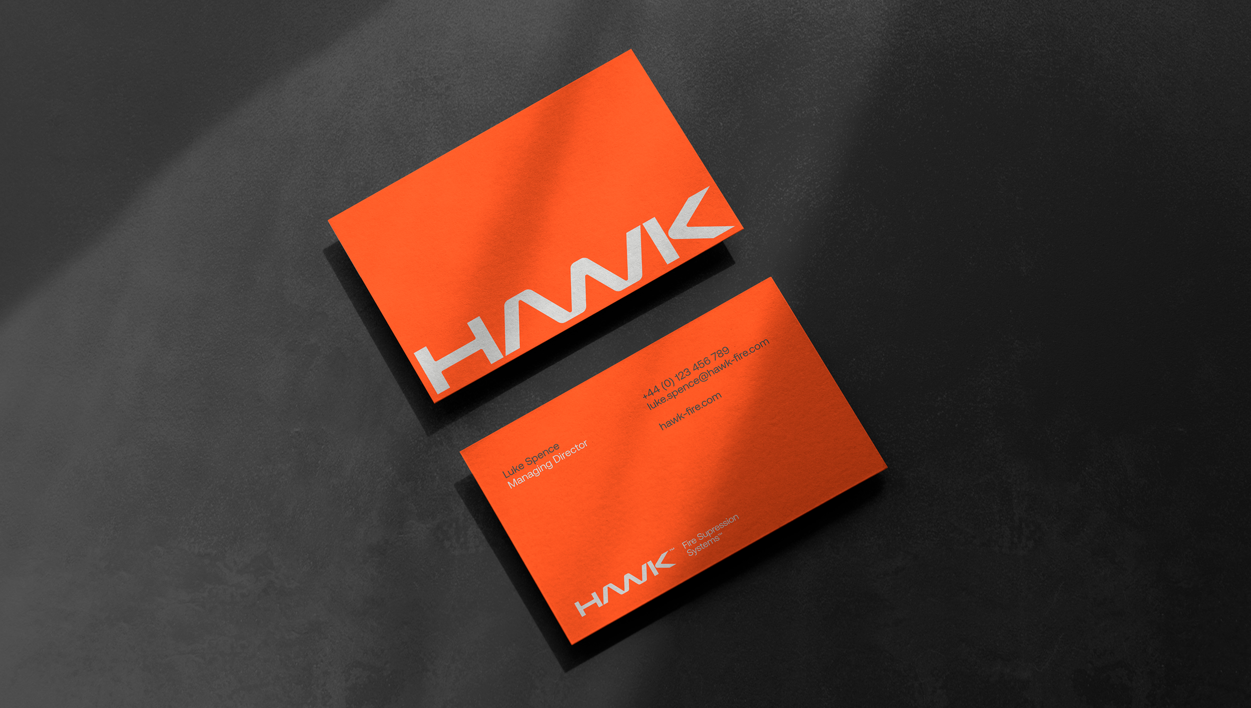
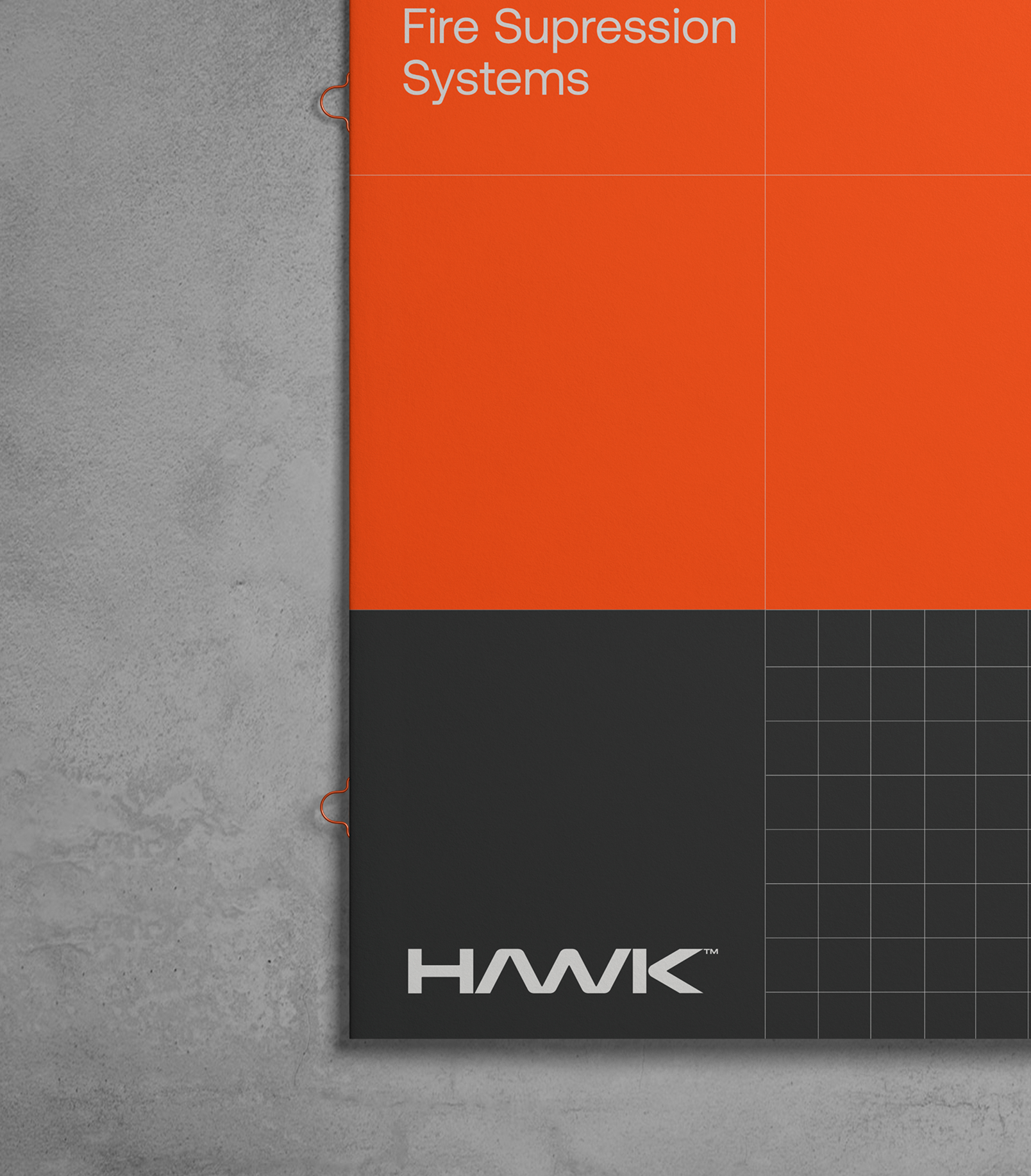
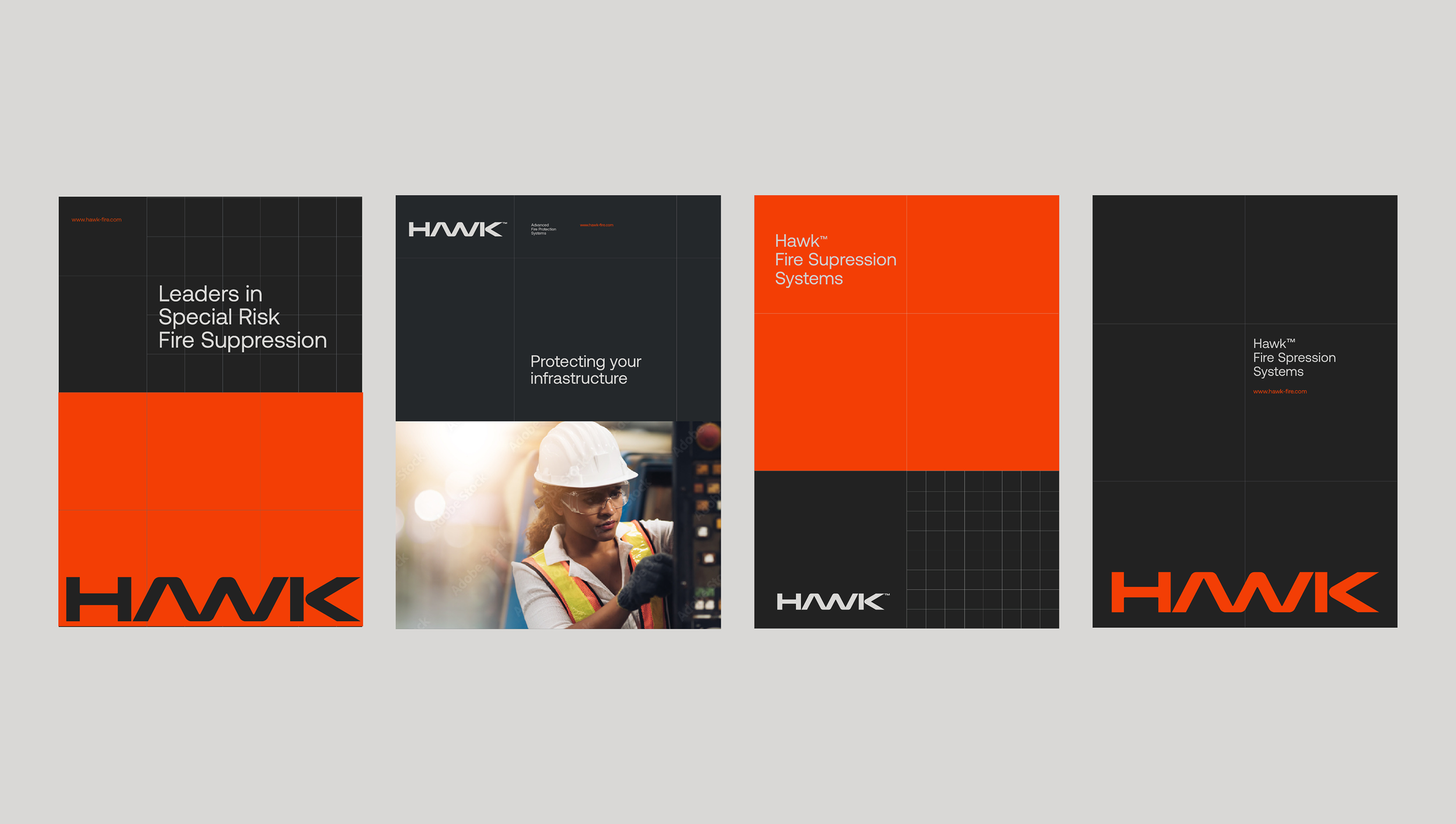
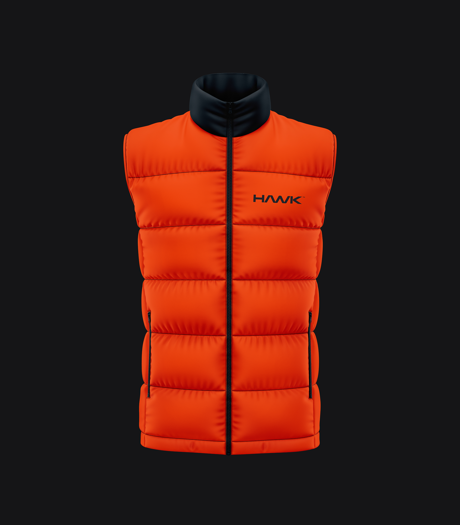
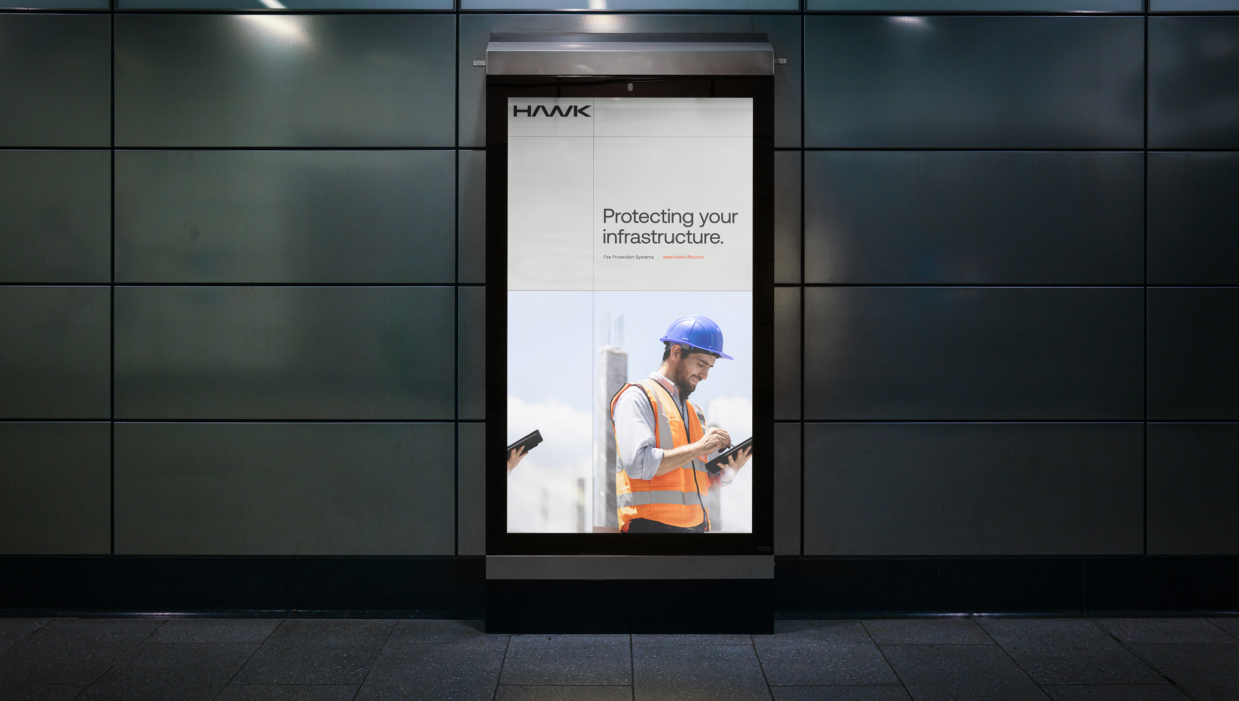
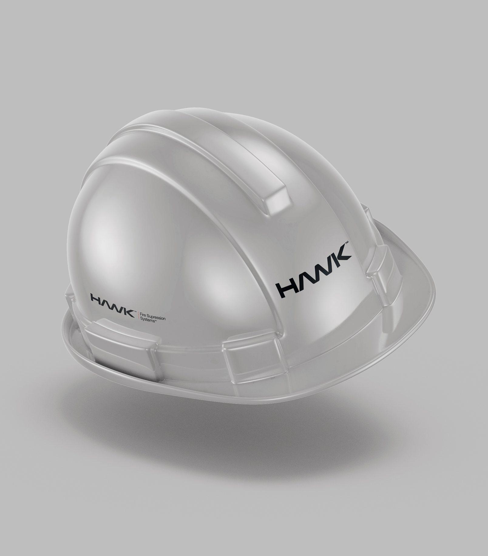
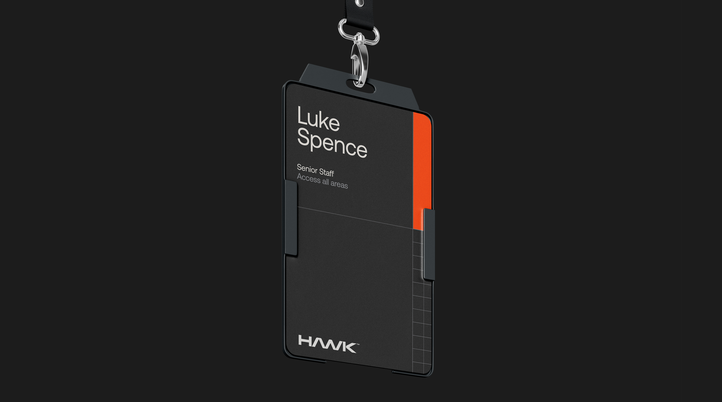
Hawk are a London based fire suppression specialist working in industrial and infrastructure sectors. They were looking for a new, bold and impactful brand that conveyed their tech focused approach. We centred the brand around a strong, dynamic and easily identifiable wordmark combined with a high visibility orange for maximum stand-out in industrial environments.

In collaboration with: Society Studios

Hawk is always vigilant, protecting client locations anywhere in the world. Inspired by the bird's-eye view of map reference grids—which can zoom in on a single point or out to reveal the bigger picture—we created a dynamic, ever-changing grid system. This flexible framework allows layout elements to shift and scale seamlessly. By layering grids of different sizes, we established a deeply detailed, highly adaptable visual identity that scales across all brand collateral.